
Chicago Booth: Transform
The Brief
The University of Chicago Booth School of Business needed a fresh approach to their admissions program for the Full-Time MBA program. The previous site, while on-brand and informative, was not engaging users and driving them to reach out to admissions directly to continue the conversation. Previous user feedback led us to believe that the site was impersonal, and that potential applicants did not get a sense of a personal connection to the school. The goal was to drive traffic to the profiles of current MBA candidates and use their unique stories to engage the user, bringing a more conversational tone to the site.
The Research
We collected data using a combination of site analytics to track user click-throughs and time-per-page as well as user interviews with samples pulled from users who followed through with the application process and those who did not complete the process. In both of these samples, we identified two interesting points that contradicted previous assumptions:
- Users were spending much less time on the site than previously thought. The amount of content being presented was largely being ignored. Users were gravitating toward concise messaging and easy to identify call to actions.
- The current group of potential applicants were much more accustomed to consuming video based content, preferring the visual medium over large blocks of written content. This correlated to an overall broad trend in usage statistics supporting an increase in video-based content at the time.
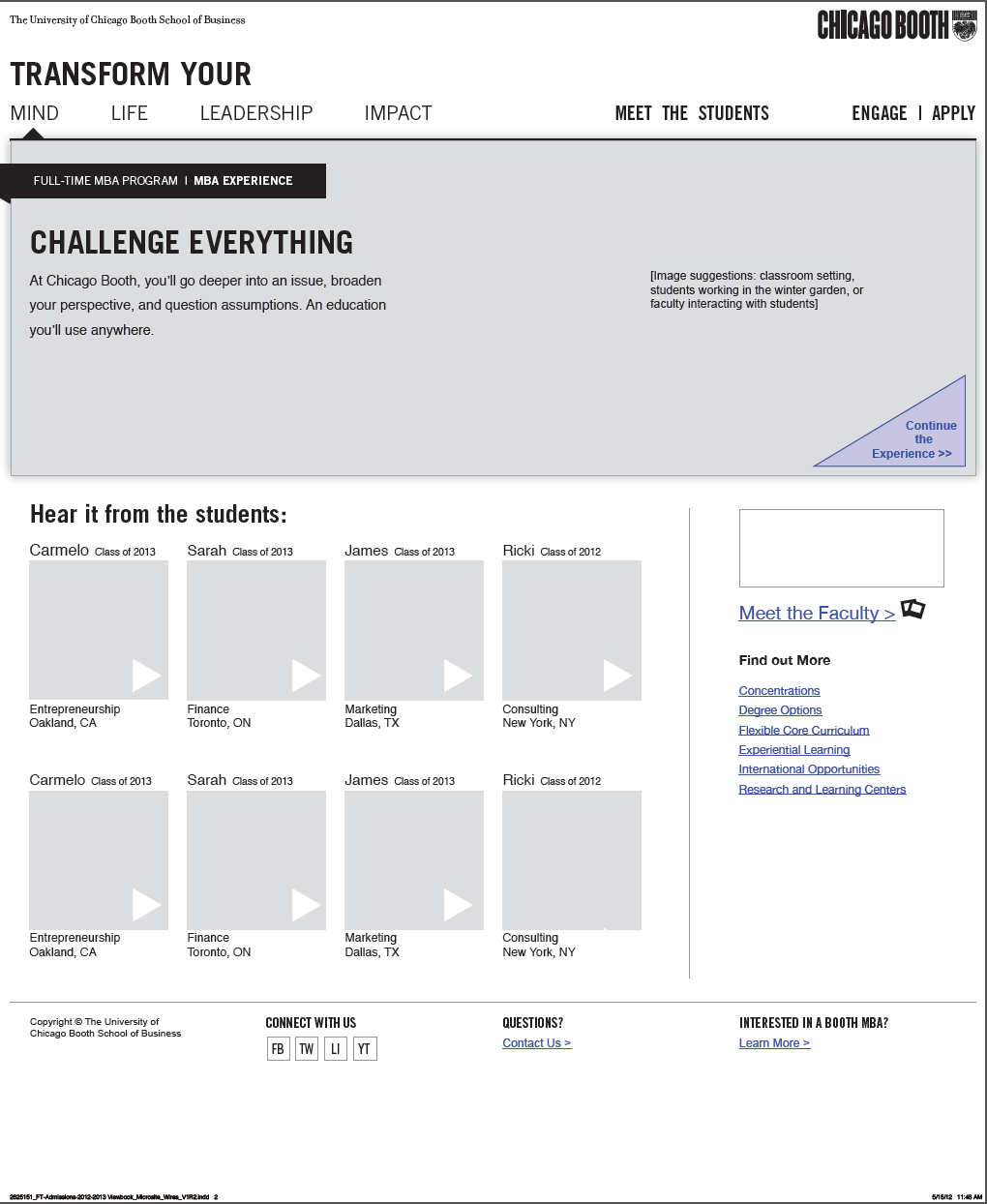
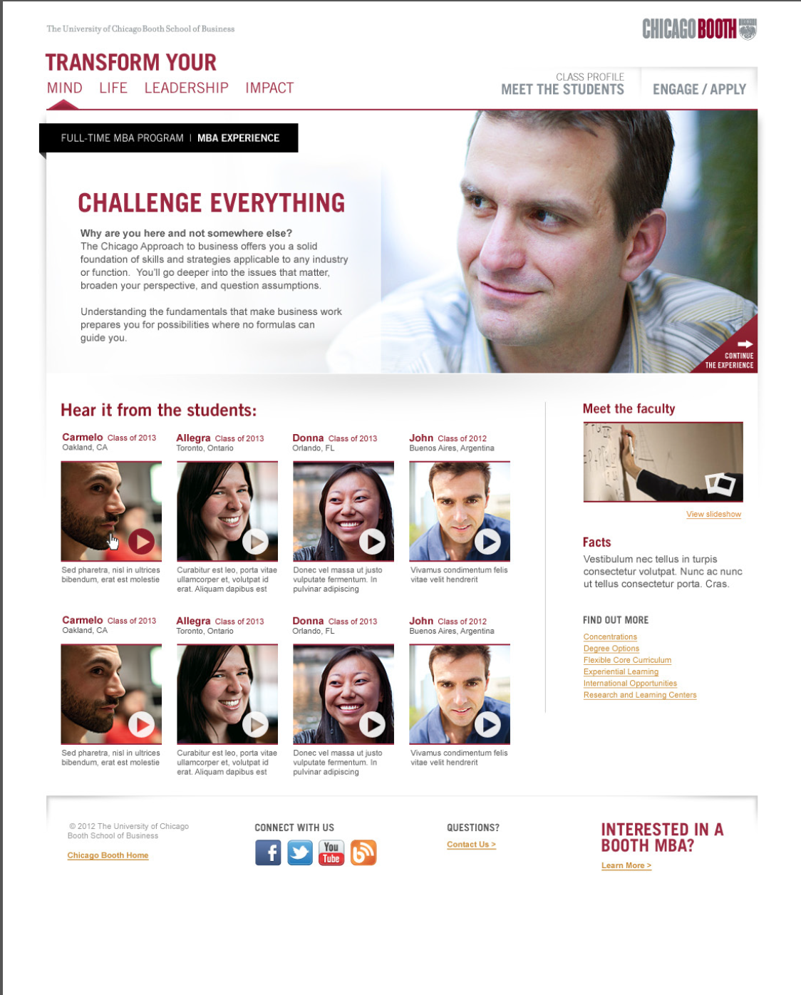
These, among other findings related to an unrestrained content strategy, led toward a strategy of minimizing the amount of written content of the site and letting the photography and video convey the personal message the school was attempting to convey.
The Execution

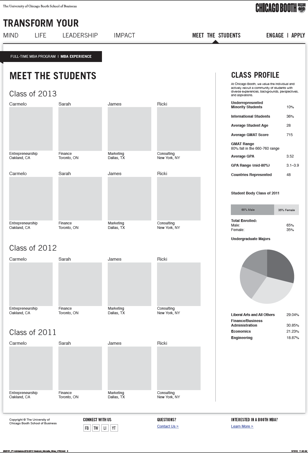
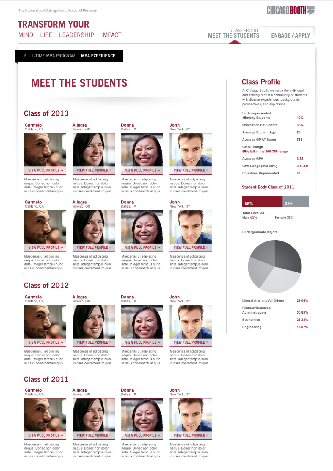
With the data, we then approached the site design from a user-centric perspective. By condensing to a singular, easy to identify call to action, we can guide the user organically through the site.
Some users place high value in the location of the school and the city of Chicago itself, while others place the cost of the investment in an MBA above all else and are looking for the most return on this investment. We used heuristic cues to guide each user to what would resonate with them, and map that to a specific point of engagement. This allows the admissions team to continue the conversation at the point in which the user left the site and reached out to the team. Deciding on which school to obtain their MBA was not a decision to take lightly, and a personal tone helped put the potential applicants at ease.
From a content strategy perspective, cutting down on the amount of copy we place on the site allows us the room to draw more attention to the content that is most engaging to the user. Videos and personal stories took precedence, and leveraging current social media usage patterns allowed us to present an interface that the user is already comfortable with.
The Result

Our success metrics for the program were attached to a broad spectrum of values, from event attendance, chat participation, to actual applications. The program itself involved a revised strategy of leveraging the website as much as possible, with minimal printed material and physical travel due to a decrease of 30% in budget from the previous year. However, the concise direct mail strategy and a refined web approach saw an incredible increase of traffic over 200% from the previous year at the same time. This traffic spent more time on the site and were more engaged with the admissions team as well as the existing student body. A more personal tone helped bridge the gap for potential applicants interested in a Chicago Booth MBA to seeing themselves as a member of the student body.